Overflow, with the culprit named
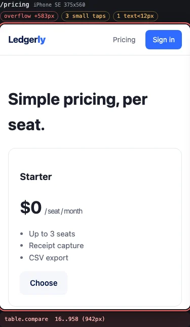
Not just a red frame. The pricing table is 583px too wide, and the footer says table.compare and its bounds. Only the outermost offender is listed, so a wide table does not report every row inside it.
wontfit shows your running web app at phone and tablet widths side by side, in the browser you already have open. It names the element that is too wide for a 375px screen and fails your build when a layout breaks.
pipx install wontfit| page | size | overflow | small taps | text<12px |
|---|---|---|---|---|
| / | 375x800 | +401px (img.shot) | 9 | 1 |
| /pricing | 375x800 | +583px (table.compare) | 3 | 1 |
| /terms | 375x800 | fits | 3 | 10 |
Pick pages and widths, or presets from iPhone SE to iPad. Each frame carries its own verdict, and the layout lives in the URL, so a review is a link you can paste into a pull request.
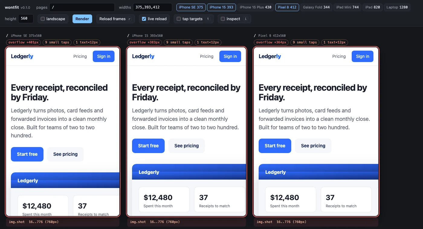
Four checks run inside every frame. They are heuristics, kept few and explainable on purpose.
Not just a red frame. The pricing table is 583px too wide, and the footer says table.compare and its bounds. Only the outermost offender is listed, so a wide table does not report every row inside it.
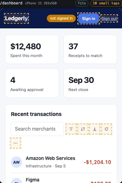
Press t to outline every interactive element smaller than 44 by 44 CSS pixels inside the frame, the size WCAG 2.5.5 and Apple's guidelines ask for.
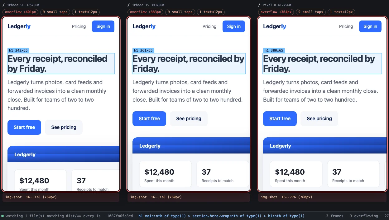
Press i and hover an element in one frame. It is highlighted with its size in every other frame, so you see the same heading at 375, 393 and 412 at once.
Swap width and height with one toggle. Here the app's fixed header grows to two rows and covers the numbers it was meant to introduce.
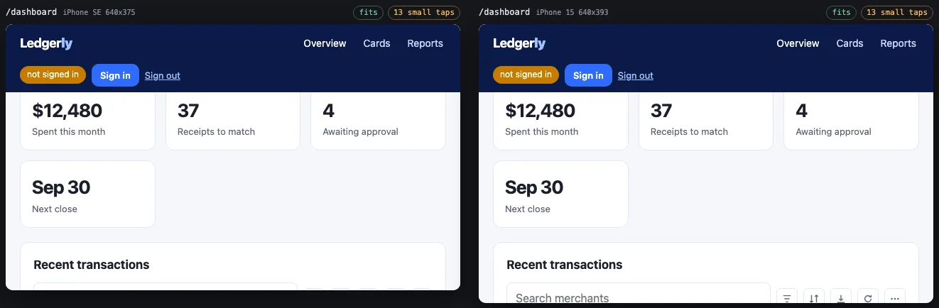
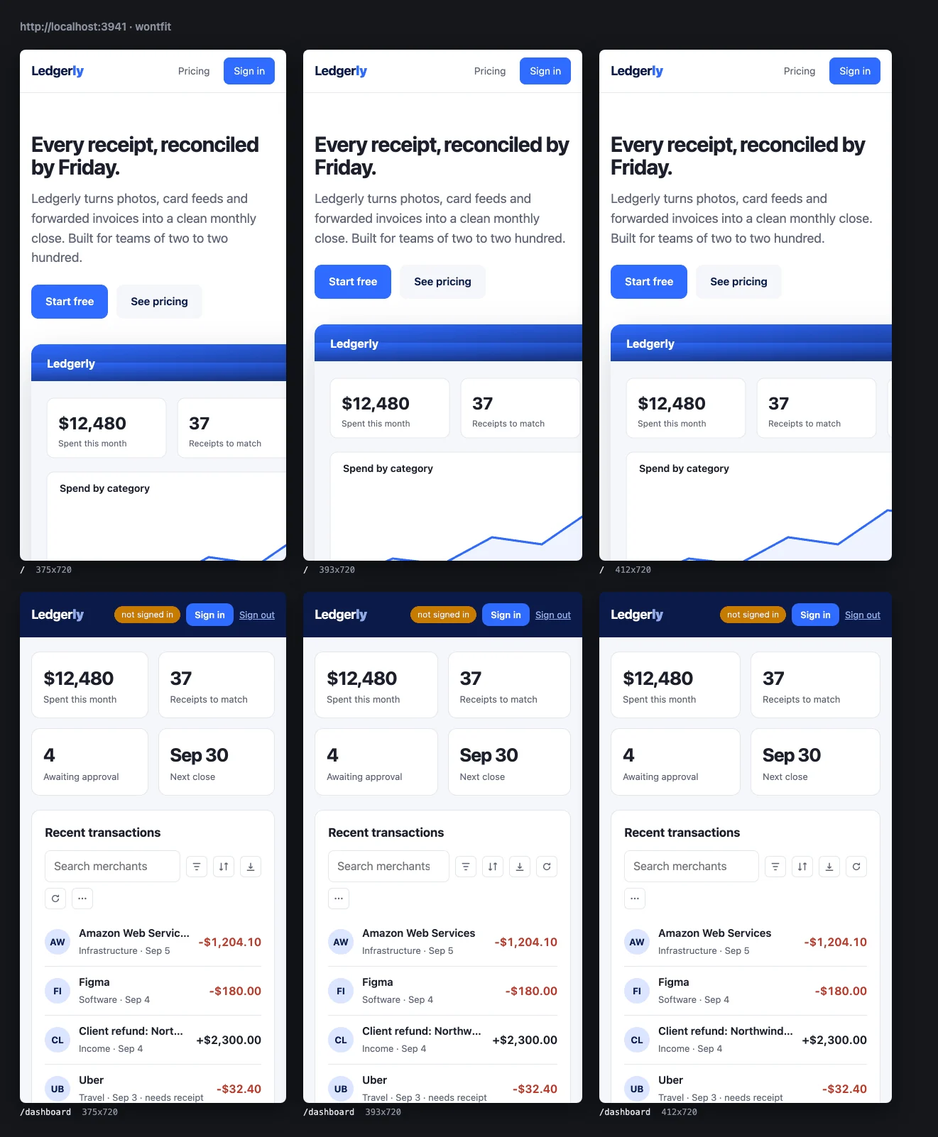
The same diagnostics run headlessly. wontfit check exits 1 on overflow and writes a JSON report; wontfit shoot writes a PNG per page and width plus a contact sheet for the review.
pip install 'wontfit[shoot]'
playwright install --with-deps chromium

wontfit check --pages /,/pricing \
  --widths se,iphone15,pixel8 \
  --fail-on overflow --json report.json

wontfit shoot --pages /,/pricing \
  --widths se,iphone15,pixel8 --out shots
A complete GitHub Actions job, a pre-push hook and recipes for twelve stacks are in the docs.
If you need synced scrolling, device bezels or emulated touch, use one of those. If you want something you can install and forget, and the same checks in CI, this is it.